Today, we're going to continue our walkthrough of the "Classifying_Iris" template provided as part of the AML Workbench. Previously, we've looked at
Getting Started,
Utilizing Different Environments,
Built-In Data Sources and started looking at Built-In Data Preparation (
Part 1,
Part 2). In this post, we're going to continue to focus on the built-in data preparation options that the AML Workbench provides. Specifically, we're going to look at the different "Inspectors". We touched on these briefly in
Part 1. If you haven't read the previous posts (
Part 1,
Part 2), it's recommended that you do so now as it provides context around what we've done so far.
We performed some unusual transformations in the last post for the sake of showcasing functionality, but they didn't have any effect on the overall project. So, we'll delete all of the Data Preparation Steps past the initial "Reference Dataflow" step.
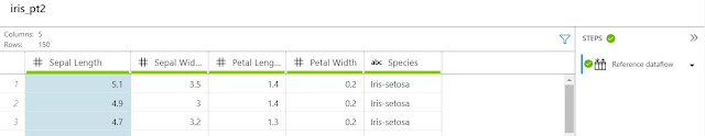 |
| Iris Data |
Next, we want to take a look at the different options in the "Inspectors" menu. When building predictive models or performing feature engineering, it's extremely important understand what's actually inside the data. One way to do this is to graph or tabulate the data in different ways. Let's see what the options are available within the "Inspectors" menu.
 |
| Inspectors |
The first option is "Column Statistics". Let's see what this does.
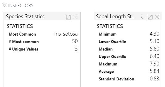 |
| Column Statistics |
If we view the statistics of a string (also known as categorical) feature, we see the most common value (also known as the mode), the number of times the mode occurs and the number of unique values. Honestly, this isn't a very useful way to look at a categorical feature.
However, when we view the statistics of a numeric feature, we get some very useful mathematical values. There are a few points of interest here. First, the median and the mean are very close. This means that our data is not heavily skewed. We can also see the minimum and maximum values, as well as the upper and lower quartiles. These will let us know if we have "heavy tails" (lots of extreme observations) or even if we have impossible data, such as an Age of 500 or -1. In this case, there's nothing that jumps out at us from these values. However, wouldn't it be easier if we could see this visually? Queue the histogram!
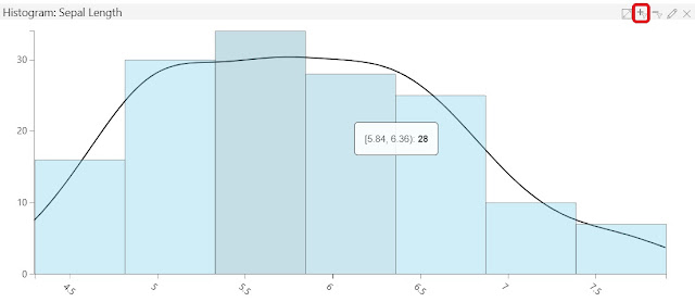 |
| Histogram |
Histograms can only be creating using numeric features. In this case, we chose the Sepal Length feature. This view gives us the same information that we saw earlier, except in a graphical format that is easier to digest. For instance, we can see that the values between 5 and 7 occur at approximately the same rate, whereas values outside of that range occur less frequently. This could be very useful information depending on which features or predictive models we wanted to build.
We also have the option of hovering over the bars to see the exact range they represent. We can even select the bars, then select the Filter icon in the top-right corner (look for the red box in the above screenshot) of the histogram to see a detailed view.
 |
| Histogram (Filtered) |
This gives us a much more precise picture of what's going on in the data. By looking at the "Steps" pane, we can see that AML Workbench accomplishes this view by filtering the underlying dataset. Keep this in mind, as it will affect any other Inspectors we have open. Yay for interactivity!
 |
| Histogram (Unfiltered) |
Interestingly, if we return to the unfiltered version, we can see the underlying filtered version as context. This could lead to some very interesting analyses in practice.
Finally, we can select the "Edit" button in the top-right of the histogram to edit the settings.
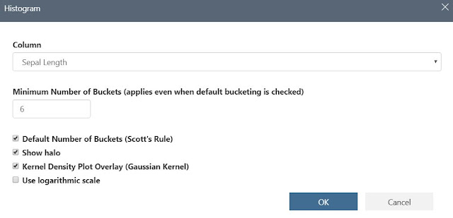 |
| Edit Histogram |
We can change the number of buckets or the scale, as well as make some cosmetic changes. Alas, let's move on to "Value Counts".
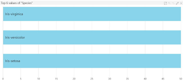 |
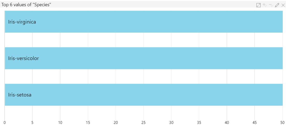
| Value Counts |
Values Counts is what we normally call a Bar Chart. It shows us the six most common values within the string feature. This number can be changed by selecting the "Edit" button in the top-right of the Value Counts chart. Given the nature of this data set, this chart isn't very interesting. However, it does allow us to use the filtering capabilities (just like with the Histogram) to see some interesting interactions between charts.
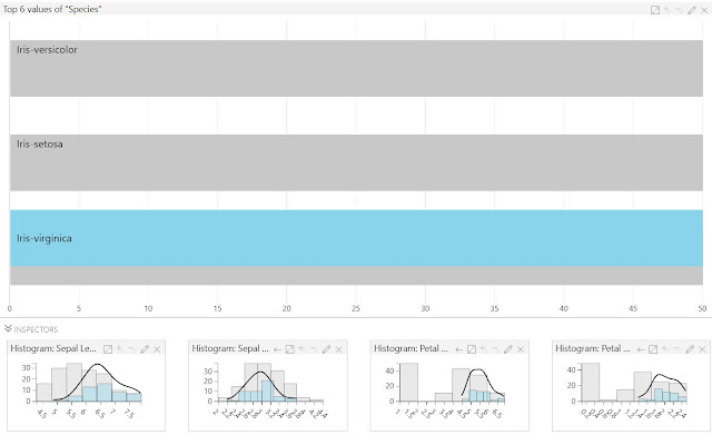 |
| Interactive Filters |
While this pales in comparison to a tool like
Power BI, it does offer some basic capabilities that could be beneficial to our data analysis.
At this point in this post, we wanted to showcase the "Pattern Frequency" chart. However, our dataset doesn't have a feature appropriate for this. Instead, we pulled a screenshot from Microsoft Docs (
source).
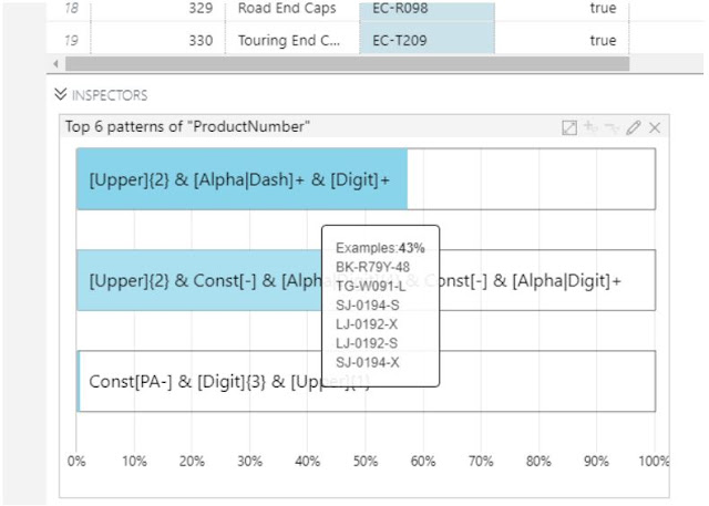 |
| Pattern Frequency |
Basically, this chart shows the different types of strings that occur in the data. This can be extremely useful if we are looking for certain types of serial numbers, ids or any type of string that has a strict or naturally occurring pattern.
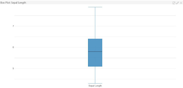 |
| Box Plot |
The next inspector is the
Box Plot. This type of chart is good for showcasing data skew. The middle line represents the median, the box represents the range between the first and third quartile (25% to 75%, aka
Interquartile Range or IQR). The whiskers extend from the IQR out to the min and max. Some box plots have a variation where extreme outliers are represented as * outside of the whiskers. Honestly, we've always found histograms to be more informative than box plots. So, let's move on to the Scatterplot.
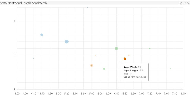 |
| Scatterplot |
The Scatterplot is useful for showing the relationship between two numeric variables. We can even group the observations by another feature. In this case, we can see that the blue (Iris-setosa) dots are pretty far away from the green (Iris-virginica) and orange (Iris-versicolor) dots. This means that there may be a way for us to predict Species based on these values (if this was our goal). Perhaps our bias is showing at this point, but this is another area where we would prefer to use Power BI. Alas, this is still pretty good for an "all-in-one" data science development interface that is (as of the time of writing) still in preview. Next is the Time Series plot.
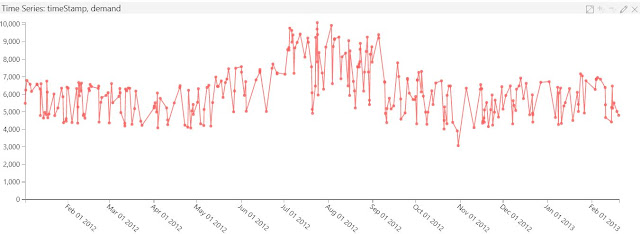 |
| Time Series |
Since our data does not have a time component, we used the Energy Demand sample (
source) instead. The Time Series plot is a basic line chart that shows one or more numeric features relative to a single datetime feature. This could be beneficial if we needed to identify temporal trends in our data. Finally, let's take a quick look at the Map.
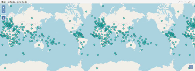 |
| Map |
Again, our dataset is lacking in diverse data. So, mapping would have been impossible. However, we were able to dig up a list of all the countries in the world (
source). We were able to use this to create a quick map. In general, we are rarely fans of mapping anything. Usually, maps end up being extremely cluttered and difficult to distinguish any significant information. However, there are rare cases where maps can show interesting results. John Snow's
cholera map is perhaps the most famous.
Hopefully, this post showed you how Inspectors can add some much needed visualizations to the data science process in AML Workbench. Visualizations are one of the most important parts of the Data Cleansing and Feature Engineering process. Therefore, any data science tool would need robust visualization capabilities. While we are not currently impressed by the breadth of Inspectors within AML Workbench, we expect that Microsoft will make great investments in this area before they release the tool as GA. Stay tuned for the next post where we'll walk through the Python notebook that predicts Species within the "Classifying Iris" project. Thanks for reading. We hope you found this informative.
Brad Llewellyn
Senior Analytics Associate - Data Science
Syntelli Solutions
@BreakingBI
www.linkedin.com/in/bradllewellyn
llewellyn.wb@gmail.com


No comments:
Post a Comment