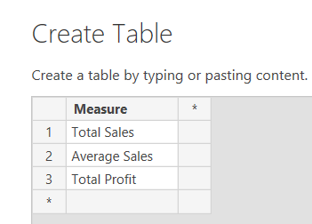
Today, we're going to talk about filter context in DAX. This feature is incredibly simple to understand, yet incredibly powerful. Before we get started, let's look at a simple data model.
 |
| Sales Data |
 |
| Data Model |
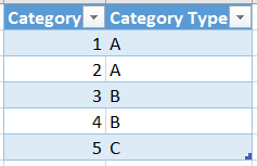
As you can see, we have a table of sales data associated to categories, as well as a category table giving us additional information about each category. Now, let's look at a simple chart using Sales[Category] (Category from the Sales table) and Sales[Sales].
 |
| Sales by Category (from Sales) |
When you create this chart, you are looking at Filter Context. Let's look at a single measure value in the table.
 |
| Sales by Category (Filter Context) |
When we look at this one value (11.76), we have to think about what filters are applied to it. Since we have a very simple pivot table, and no external slicers or filter, the only filter applied to this value is "Sales[Category] = 1". Similarly, we can say that the filter context for row 2 is "Sales[Category] = 2". Let's add another layer to the pivot table.
 |
| Sales by Category and Order Number (from Sales) |
Here, we have a value with a filter context of "Sales[Category] = 1 AND Sales[Order Number] = 6".
EDIT: The above filter context should be "Sales[Category] = 1 AND Sales[Order Number] = 8". Thanks to Benjamin for pointing this out.
Let's flip this pivot around to see if the numbers change.
EDIT: The above filter context should be "Sales[Category] = 1 AND Sales[Order Number] = 8". Thanks to Benjamin for pointing this out.
Let's flip this pivot around to see if the numbers change.
 |
| Sales by Category and Order Number (Pivotted) |
Even though the chart looks different, the filter context remains exactly the same. Therefore, the value doesn't change. Let's take this one step further and look at Sales by Categories[Category].
 |
| Sales by Category (from Categories) |
These are the same exact values we saw earlier. This is because we have a relationship defined between the two tables. So, we can say that the filter context is "Categories[Category] = 1", which is the same as "Sales[Category] = 1". It's very important to note that Filter Context can move across relationships. What would happen if we tried to go the other way? Can we apply a filter on the Sales table and have it affect a measure from the Categories table? First, we need to create a measure in the Categories table.
 |
| Categories |
Now, we can place this in a Pivot table with Order Number, which is DOWN the hierarchy from Categories. If the filter context is unused, then Categories should return 4 for every row because there are 4 total rows in the Categories table. Let's see what happens.
 |
| Categories by Order Number |
Interestingly, we can use filter context in this direction as well. The one caveat here is that the measure is no longer additive. Notice how the "Total" row shows 4 categories? This is the correct number of Total Categories, but the sum of the Categories column far exceeds 4. Let's try something else. Let's add another row to the Categories table for Category 5, even though there are no rows in the Sales table to link to it.
 |
| Categories (New) |
Now, what will happen if we place categories on a pivot table with Sales[Category]?
 |
| Categories by Category (from Sales) |
Obviously, we would expect the Categories measure to return 1 for each category. However, the pivot doesn't show Category 5 because we're using Category from the Sales table, which has an incomplete list of Categories. This is one of many reasons why it's generally better to use slicers from your lookup table if possible.
Now that we've seen how filter context is applied via simple charts, let's add a page-level filter to the mix as well.
 |
| Sales by Order Number (with Filters) (No Selection) |
Since we have not selected anything in the filters, the filter context for the highlighted value is "Order Number = 1". Let's make a selection.
 |
| Sales by Order Number (with Filters) (Category Type = A) |
Now, the filter context is "Order Number = 2 AND Category Type = A". Since Filter Context is the combination of ALL filters applied to the measure, we can get the same result by using visual interactions instead of filters. (FYI, a slicer in Power BI is technically a measure-less chart. This means that a slicer interacts with a chart in the same way that two charts interact with each other.)
 |
| Sales by Order Number (with Interaction) (Category Type = A) |
The final type of filter we want to talk about are defined directly in the measure definition. The CALCULATE() function can be used to calculate a measure, using a set of pre-defined filters. For instance, we can create a measure called "Sales for Category 1" that gives us the total sales for only Category 1.
| Sales for Category 1 |
 |
| Sales for Category 1 (Chart) |
We hope this post helped you on the way to understanding how filter context works and how you can exploit it to solve some of your problems. We've barely scratched the surface here and there's plenty more to talk about. Thanks for reading. We hope you found this informative.
Brad Llewellyn
BI Engineer
Valorem Consulting
@BreakingBI
www.linkedin.com/in/bradllewellyn
llewellyn.wb@gmail.com
BI Engineer
Valorem Consulting
@BreakingBI
www.linkedin.com/in/bradllewellyn
llewellyn.wb@gmail.com